acqua & vita
overview
Development of the corporate website for Acqua & Vita, a company specializing in residential drinking water treatment solutions.
scope of work
Design and presentation of the company’s services and products through a more contemporary visual language compared to industry standards.
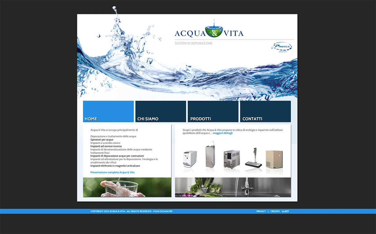
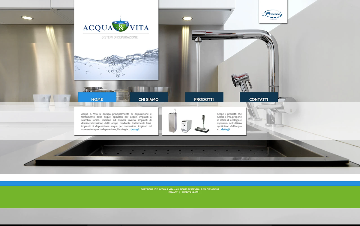
Three alternative homepage concepts were developed to define the foundational stylistic direction for the entire web project, allowing strategic evaluation of layout, tone, and visual hierarchy.
creative approach
The visual identity strongly references the element of water, both chromatically and conceptually.
The layout leverages transparency effects to evoke fluidity and lightness, combined with gradient tones leaning toward blue to reinforce the connection with the aquatic environment.
Color accents derived from the corporate logo were integrated to maintain brand consistency, resulting in a modern, immersive, and visually cohesive digital experience.
panorama
Development of the corporate website for Acqua & Vita, a company specializing in residential drinking water treatment solutions.
ambito di lavoro
Design and presentation of the company’s services and products through a more contemporary visual language compared to industry standards.
Three alternative homepage concepts were developed to define the foundational stylistic direction for the entire web project, allowing strategic evaluation of layout, tone, and visual hierarchy.
approccio creativo
The visual identity strongly references the element of water, both chromatically and conceptually.
The layout leverages transparency effects to evoke fluidity and lightness, combined with gradient tones leaning toward blue to reinforce the connection with the aquatic environment.
Color accents derived from the corporate logo were integrated to maintain brand consistency, resulting in a modern, immersive, and visually cohesive digital experience.