acquatech romagna
overview
Development of the corporate website for Acquatech Romagna, a company specializing in air conditioning systems and water purification solutions.
scope of work
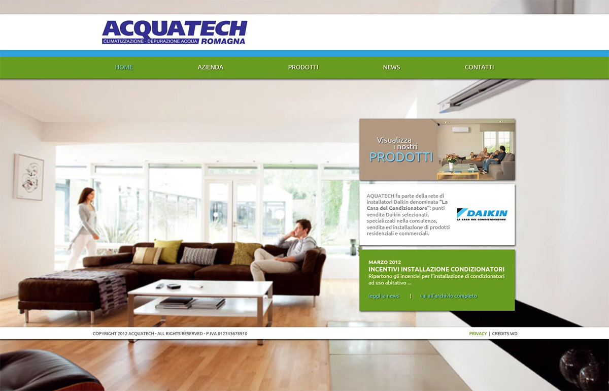
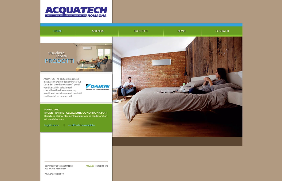
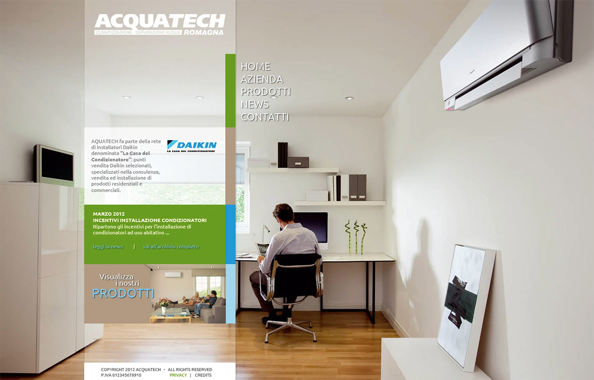
Design of three alternative homepage layout proposals to define the visual and structural direction of the entire website.
Particular emphasis was placed on highlighting company news and updates, as well as clearly showcasing the brands officially represented and distributed.
creative approach
The visual language was built around soft color tones and imagery of domestic environments, evoking comfort, tranquility, quality of life, and positive living experiences.
The palette combines corporate colors with shades associated with the home experience, ensuring both brand consistency and emotional resonance.
Linear graphic elements and recurring visual motifs were integrated throughout the layouts to reinforce chromatic coherence and structural identity.
Modern, squared typefaces were selected to communicate clarity, reliability, and a contemporary technical character.
panorama
Development of the corporate website for Acquatech Romagna, a company specializing in air conditioning systems and water purification solutions.
ambito di lavoro
Design of three alternative homepage layout proposals to define the visual and structural direction of the entire website.
Particular emphasis was placed on highlighting company news and updates, as well as clearly showcasing the brands officially represented and distributed.
approccio creativo
The visual language was built around soft color tones and imagery of domestic environments, evoking comfort, tranquility, quality of life, and positive living experiences.
The palette combines corporate colors with shades associated with the home experience, ensuring both brand consistency and emotional resonance.
Linear graphic elements and recurring visual motifs were integrated throughout the layouts to reinforce chromatic coherence and structural identity.
Modern, squared typefaces were selected to communicate clarity, reliability, and a contemporary technical character.